White oak
Strong for warm-modern, coastal, transitional, and organic interiors. Rift or quartered cuts can make the grain more linear and controlled, while plain sawn cuts read more traditional and active.
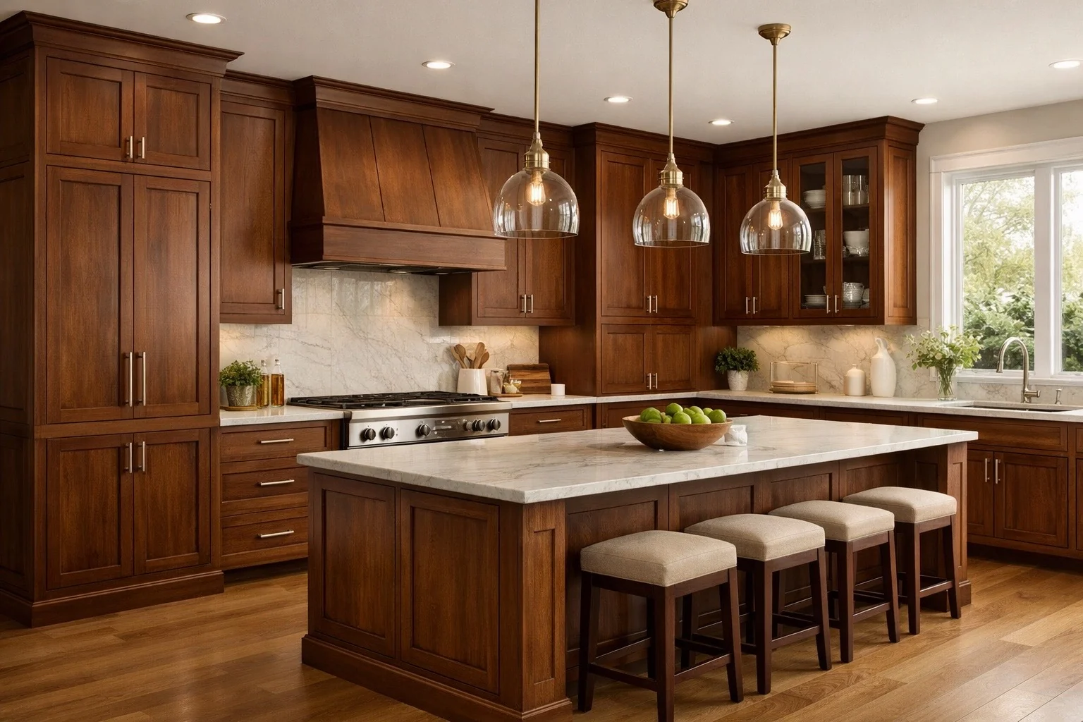
Stained cabinetry is strongest when the wood species, grain pattern, stain tone, and surrounding palette are treated as part of the design. It adds natural character that paint cannot replicate, but it also carries variation that must be understood before approval.
Stain allows the species, grain, cut, board selection, and natural variation to remain visible. That is the point. A stained cabinet finish can make a room feel grounded, warm, tactile, and custom, but it should never be selected as if every door will look identical to a small sample.
Warm modern kitchens, refined traditional rooms, furniture-like vanities, bars, offices, islands, built-ins, and spaces that need authentic material depth instead of a fully opaque color.
Stain makes the wood species part of the design story. It can create richness and longevity when the tone, grain, and room palette are disciplined.
Natural color variation, uneven absorption by species, undertones that become orange or red, too much visible grain, and samples that cannot show every board in the full project.
Stained finishes can be forgiving visually because grain hides some wear, but water, harsh cleaners, UV exposure, and impact can still damage the protective topcoat.
A stained finish generally includes surface preparation, color application, sealing, and a protective topcoat. The stain itself influences tone and grain emphasis, while the topcoat protects the surface and establishes sheen. Because the finish is transparent or semi-transparent, the wood underneath remains visually active.
That visibility is both the beauty and the responsibility of stained cabinetry. A stained finish is not a paint alternative for clients who want perfect uniformity. It is a material-forward choice for clients who value natural variation and warmth.
The same stain can look meaningfully different on maple, oak, walnut, cherry, alder, hickory, or veneer. Species selection should happen before judging the final stain tone.
Strong for warm-modern, coastal, transitional, and organic interiors. Rift or quartered cuts can make the grain more linear and controlled, while plain sawn cuts read more traditional and active.
Rich, darker, and naturally sophisticated. Walnut often works best when allowed to be walnut rather than forced into a color that hides its depth and variation.
Fine-grained and cleaner looking, but it can be less forgiving with certain stain tones because absorption and blotching can be harder to control than clients expect.
Warm, classic, and capable of rich depth. It can darken and warm over time, so it should be selected with long-term color shift in mind.
Useful when a softer, rustic, casual, or character-forward wood story is desired. Knots and variation are part of the look, not defects.
Highly expressive and energetic. Best when the room can support strong grain contrast and the client wants visible personality, not a quiet backdrop.
A stained kitchen with strong grain is not neutral just because the color is brown, tan, or natural. The grain itself creates movement across the room. When paired with a busy countertop, high-variation tile, ornate hardware, and patterned flooring, the room can become visually loud quickly.
The most elevated stained rooms usually control how many surfaces are allowed to be expressive at once. If the cabinets carry grain, the rest of the palette may need to become calmer.
Stained cabinetry can become dated quickly when undertones are ignored. Orange, red, yellow, gray, and green undertones all change how the cabinetry relates to flooring, stone, tile, lighting, and adjacent paint.
Best when the goal is relaxed warmth, organic texture, or modern restraint. They require careful pairing with floors so the room does not become one large similar wood tone.
Often the most flexible range for warmth and richness. They can bridge classic and current, but the wrong yellow, orange, or red cast can make the room feel dated.
Can feel dramatic, formal, and premium. They also reduce visible grain contrast, show dust and fingerprints, and can make a room feel heavy if light and contrast are not handled well.
Can be useful in certain coastal or modern palettes, but they can turn flat or cold if not balanced with warmth elsewhere.
Can be timeless when balanced correctly. The key is avoiding an overly orange or red result unless that warmth is intentionally part of the architecture.
Useful when standard programs do not fit the palette. They add approval discipline because small sample differences can become large visual differences across full cabinetry.
Stain gives color and depth, but the topcoat is what protects the cabinet surface in daily use. A quality stained finish should be cared for with the same discipline as a painted finish: soft cloths, mild cleaners, minimal moisture, and no abrasive scrubbing.
Grain can visually hide minor marks better than a flat painted color, but it does not make the finish invulnerable. Water left on edges, aggressive cleaning, repeated impact, and concentrated sunlight can still damage or change the surface over time.
A stained finish can be a strong value when it lets the selected wood species do meaningful design work. Instead of relying on applied color alone, the cabinetry contributes depth, warmth, and texture.
Costs rise when the project demands tighter grain control, premium species, custom tone, specialty effects, or feature-level matching. Those upgrades can be worthwhile in highly visible zones, but they should be selected because the room benefits from that level of material control.
Stain is not the right choice for every client. It should be chosen because the client wants wood character, not because they want paint-level uniformity in a warmer color.
A sample door shows one expression of one piece of wood. It cannot guarantee exact color, grain, mineral streaking, or tone across a full project.
Some woods accept stain more evenly than others. Professional finishing can control and improve the result, but it cannot make every species behave identically.
Warm stains can drift orange, red, or yellow. Cooler stains can drift gray, green, or flat. The full palette needs to be checked before approval.
Wood color can shift with time and light exposure. Cherry, walnut, and other species can develop richer or different tones as the room ages.
Strong grain beside dramatic stone, patterned tile, heavy hardware, and detailed doors can create visual competition.
Minor scratches may blend better than paint in some cases, but deep damage, topcoat failure, water swelling, or UV differences can still be difficult to make invisible.
A whole stained kitchen can be beautiful, but stain is also highly effective in selected zones where warmth and material character are needed.
A stained island can ground a painted kitchen and introduce warmth without making every cabinet wood.
Stain can make focal cabinetry feel more like furniture and less like a standard cabinet run.
Wood tone can create a richer mood in smaller feature areas where a full kitchen stain story would feel too heavy.
A stained vanity can add warmth to stone, tile, and metal-heavy bathrooms.
Stain works naturally in libraries, offices, media rooms, and display cabinetry where a furniture tone feels appropriate.
Wood shelves can connect cabinetry to flooring or furniture without committing the entire cabinet package to stain.
When species, grain, tone, topcoat, lighting, and surrounding materials are aligned, stained cabinetry can add warmth and authenticity that painted finishes cannot duplicate.