Whites and creams
Best when the goal is lightness, freshness, or timeless calm. They require careful undertone testing because a white can become icy, yellow, gray, or dull depending on light and surrounding materials.
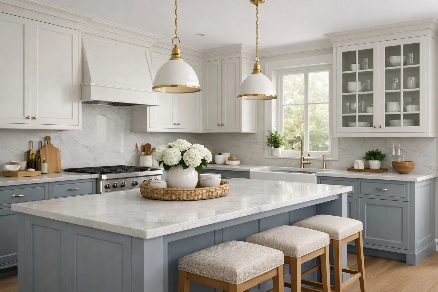
Painted cabinetry is one of the most flexible finish directions because it can lean classic, transitional, coastal, warm modern, or bold. Its success depends on color, sheen, substrate, door construction, lighting, and honest expectations around wear.
Painted cabinetry covers most visible wood character and allows the cabinet color to become a controlled design element. That control is why painted finishes are so popular, but it also means color temperature, sheen, panel movement, edge wear, and touch-up behavior matter more than clients often expect.
Clean kitchens, timeless white or warm-neutral palettes, transitional cabinetry, lighter rooms, vanities, laundry rooms, built-ins, and projects where the cabinetry should support the room rather than expose grain.
Paint gives the most control over color and mood. It can make a room feel brighter, calmer, more tailored, or more current without requiring a highly expressive wood species.
Chips, corner wear, skin oils at touch points, water near sinks, visible seams on five-piece doors, dark colors showing dust, and whites reading too cold, yellow, gray, or flat in real light.
Painted finishes are very livable when cared for properly, but they are not immune to impact. Touch-ups are possible, yet a repaired area may never disappear completely.
A painted finish uses pigmented color to create a more uniform surface. Depending on the cabinet program, the finish may be applied over paint-grade maple, MDF, hardwood frames with MDF center panels, or other approved paint-grade components. The goal is a durable, consistent cabinet finish, not the same behavior as wall paint.
Because paint is opaque, it shifts attention toward door profile, reveal lines, hardware, sheen, and color accuracy. A simple shaker door in white, mushroom, navy, green, or charcoal can feel completely different even when the construction is identical.
Painted cabinets often fail when the color is selected too early. The same white, taupe, green, or blue can read differently beside different flooring, countertop veining, backsplash tile, wall paint, hardware, and window exposure.
Best when the goal is lightness, freshness, or timeless calm. They require careful undertone testing because a white can become icy, yellow, gray, or dull depending on light and surrounding materials.
Mushroom, taupe, greige, clay, and soft beige can add warmth without committing to wood. These tones often pair well with natural stone, brass, bronze, and warm white oak.
Strong for islands, vanities, bars, and selective cabinetry runs. The risk is trend fatigue if the color is too saturated or if it competes with backsplash, stone, or flooring.
Charcoal, black, espresso, deep green, and navy can feel elevated and dramatic. They also show dust, fingerprints, edge wear, and installation marks more readily than mid-tone finishes.
Dusty, softened colors usually age better than highly saturated colors. They give character while still allowing the countertop, lighting, and hardware to remain part of the composition.
Paint works well for contrasting islands or base cabinets, but the two colors need a clear hierarchy. A room can feel busy quickly when upper, lower, island, hood, and built-in colors all compete.
Wood and wood-based components respond to temperature and humidity. In a painted five-piece door, fine lines can appear where rails, stiles, and panels meet. This is not automatically a defect; it is often a normal reality of painted cabinetry, especially in homes with seasonal humidity swings.
A good cabinet program, proper material selection, controlled humidity, and disciplined installation can reduce the risk. They cannot make every painted joint behave like a single molded plastic part.
Clients often focus on color first, but sheen can be just as important. The same painted finish can feel soft and furniture-like in a matte or satin finish, or sharper and more reflective in a higher sheen.
Feels soft, calm, and current. It can reduce glare, but it may show oils, burnishing, or cleaning marks if abused. Best when the room wants a quieter, less reflective finish.
Often a strong middle ground for cabinetry. It gives enough life to the finish without making every surface reflection the main event.
Brighter and more reflective. It can feel polished, but it also makes surface quality, dust, fingerprints, brush-like texture, and glare more noticeable.
The best daily care is simple: use a soft cloth, mild soap when needed, minimal water, and a dry follow-up wipe. High-touch areas around trash pullouts, sinks, dishwashers, coffee stations, bath vanities, and cooking zones should be cleaned before oils, moisture, and residue build up.
Painted finishes can be touched up, but touch-up should be treated as maintenance, not invisibility. Color, sheen, age, light exposure, and repair texture can keep a touched-up spot from blending perfectly.
A standard painted finish in a proven color can be an efficient way to create a polished room. A custom color, hand glaze, brushed effect, or specialty topcoat can elevate the result but also adds coordination, cost, and lead-time considerations.
The value question is whether the selected paint finish gives the room better clarity. Paying more for a color or effect only makes sense when it improves the whole composition.
Painted cabinetry is a strong choice for many projects, but clients should understand where it is vulnerable before it is specified.
Deep chips can expose the substrate or underlayer. This is more visible on light finishes over darker material or dark finishes that catch edge wear.
Fine joint lines can appear on painted five-piece doors when components move seasonally. Proper material choices help, but they do not erase physics.
Touch-up material, aging, UV exposure, and different batches can create minor color or sheen differences over time.
White cabinets look clean and timeless, but they make crumbs, scuffs, shadows, caulk lines, hardware alignment, and wall color undertones more obvious.
Dark paint can be beautiful and dramatic, but it tends to show dust, fingerprints, and small surface marks sooner than mid-tone finishes.
Trash pullouts, sink bases, appliance garages, pet areas, and lower drawers used by children will usually show wear before quieter cabinet areas.
A painted cabinet finish should be approved only after it has been tested against the room’s actual palette and the household’s maintenance expectations.
Review the painted sample beside the countertop, backsplash, flooring, wall color, and hardware under daytime and evening light.
Choose the sheen for the room’s light level and use pattern, not just because it looks good on a small sample.
Detailed profiles collect more shadow and glaze. Slab or very simple doors make flatness, sheen, and alignment more obvious.
Make sure steam, heat, and moisture from dishwashers, ovens, and small appliances have been considered.
Hardware should protect high-touch painted surfaces and support the cabinet color temperature.
Discuss chips, touch-up, joint lines, cleaning, and normal wear before the finish becomes a final specification.
When color, sheen, construction, countertop, hardware, and maintenance expectations are aligned, painted cabinetry can be one of the most versatile premium finish directions.